
반응형
📝블록태그
- 테트리스 블록처럼 층층이 쌓여가는게 특징
- 블록요소안에 블록요소 가능
- 블록요소 안에 인라인 요소 가능
- 일부 블록요손 블록요소를 포함 할 수 없다.
- 기본적 가로사이즈 100%
- 가로 세로 사이즈 적용 가능
- 안쪽 바깥족 여백 모든방향 적용 가능
📝블록태그 종류
<address>, <article>, <aside>, <audio>, <blockquote>, <canvas>, <dd>, <div>, <dl>, <fieldset>, <figcaption>, <figure>, <footer>, <form>, <h1>, <h2>, <h3>, <h4>, <h5>, <h6>, <header>, <hgroup>, <hr>, <noscript>, <ol>, <output>, <p>, <pre>, <section>, <table>, <ul>, <video>
📝인라인태그
- 한줄로 선처럼 나열이 된다.
- 안쪽여백, 바깥쪽여백은 좌우측만 적용
- 가로 세로 사이즈 적용이 안 된다.(일부요소는 가능 , input, select, img)
- 인라인 요소엔 인라인요소만들어간다.
- 자신의 부모의 가로폭보다 현재 가로폭이 길면 다음줄로 넘어간다.
📝인라인태그 종류
<a>, <abbr>, <acronym>, <b>, <bdo>, <big>, <br/>, <button>, <cite>, <code>, <dfn>, <em>, <i>, <img>, <input>, <kbd>, <label>, <map>, <object>, <q>, <samp>, <small>, <script>, <select>, <span>, <strong>, <sub>, <sup>, <textarea>, <tt>, <var>
📝display - block
<!DOCTYPE html>
<html lang="en">
<head>
	<meta charset="UTF-8">
	<meta http-equiv="X-UA-Compatible" content="IE=edge">
	<meta name="viewport" content="width=device-width, initial-scale=1.0">
	<title>Document</title>
</head>
<style>
.container {
	border : 2px green solid;
}

.footnote{
	color:red;
}

span {
	background-color: powderblue;
	display: block;
	width: 100px;
	height: 60px;
}

</style>
<body>
<div class="container">
	<span>block span</span>과 <span>block span</span>입니다.
</div>
<b class="footnote">* 한 줄을 독점적으로 차지하여 옆에 다른 태그가 배치되지 않는다.</b>

</body>
</html>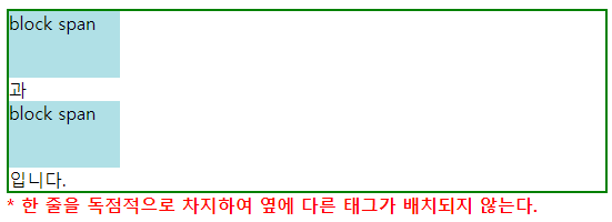
인라인태그를 블록태그취급합니다.밑으로 쌓이고 넓이를 길게 가져가는 특징이 있죠
📝display - inline
<!DOCTYPE html>
<html lang="en">
<head>
	<meta charset="UTF-8">
	<meta http-equiv="X-UA-Compatible" content="IE=edge">
	<meta name="viewport" content="width=device-width, initial-scale=1.0">
	<title>Document</title>
</head>
<style>
.container{
	background-color: orange;
}

.footnote{
	color:red;
}

div div {
	display : inline;

	background-color: powderblue;
}
</style>
<body>
<div class="container">
	<div>inline Div</div>
	<div>inline Div</div>
	<div>inline Div</div>
</div>
<b class="footnote">* inline박스는 라인 안에 다른 요소들과 함께 배치 공간이 좁으면 남은 부분이 다음 라인으로 넘어간다</b>

</body>
</html>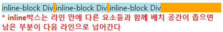
블록태그를 인라인태그취급합니다 옆으로 쌓이는 특징이 있습니다.
📝display - inline-block
<!DOCTYPE html>
<html lang="en">
<head>
	<meta charset="UTF-8">
	<meta http-equiv="X-UA-Compatible" content="IE=edge">
	<meta name="viewport" content="width=device-width, initial-scale=1.0">
	<title>Document</title>
</head>
<style>
.container{
	background-color: orange;
}

.footnote{
	color:red;
}

div div {
	display : inline-block;
	border : 2px dotted orangered;
	background-color: powderblue;
	margin : 10px;
	width: 60px; height: 80px;
}
</style>
<body>
<div class="container">
	<div>inline-block Div</div>
	<div>inline-block Div</div>
	<div>inline-block Div</div>
</div>
<b class="footnote">* inline-block 박스는 라인 안에 다른 요소들과 함께 배치 동시에 width, height, margin으로 크기 조절도 가능</b>

</body>
</html>
인라인 속성(오른쪽으로 채워지는)을 가지고 블록 속성(width ,height을 가짐)
반응형